
Color Palette Ideas: Your Friendly Guide to Painting (and Re-Painting) Your World
Introduction: What’s Your Color Story, Friend?

Ever walk into a room and instantly feel cozy, energized, or even a little meh? 🤔 Colors are doing that heavy lifting behind the scenes! Back when I moved into my first apartment, I spent weeks pinning aesthetic color palettes and still ended up with walls that looked like emoji soup. FYI, you don’t have to repeat my rookie mistakes. In this friendly chat, we’ll explore color palette ideas that turn any blank canvas into a home that feels so you. Ready to dive in?
Generate Your Color Palette
The Power of a Home Color Palette

Why Bother Curating Colors?
Choosing random paints is like cooking without tasting—messy at best. A cohesive home color palette:
- Creates flow from room to room
- Highlights architectural features
- Saves cash on trial-and-error repainting
- Makes décor shopping waaay easier (no more guessing which throw pillow works)
The 60-30-10 Rule
- 60 % – Dominant hue (usually walls)
- 30 % – Secondary color (furniture, rugs)
- 10 % – Accent punch (pillows, art)
Stick to that ratio, and suddenly your interior color schemes feel curated instead of chaotic.
Mood Matching: Color Psychology in Action
Warm vs. Cool
- Warm shades (reds, oranges) = energy, conversation, appetite
- Cool tones (blues, greens) = calm, focus, spa vibes
Pro tip: Want a zen retreat? Mix cool hues with neutral color palette staples like taupe or greige.
Light Play
Natural light changes everything! South-facing rooms amplify warm tones, while north-facing spaces need brighter, warm whites. Curious how light shapes design? Peep our guide on living room lighting ideas for aha moments.
Color Combinations That Never Fail

Classic Duo List
- Navy + Crisp White – Coastal freshness
- Sage + Warm Wood – Nature-approved calm
- Charcoal + Mustard – Moody meets playful
- Blush + Gold – Subtle glam
Feeling indecisive? Browse wall decor ideas to see these combos in action.
Unexpected Trios
- Terracotta, Teal & Cream
- Olive, Dusty Pink & Charcoal
- Black, Camel & Forest Green
These trios pop up in trendy color palettes all over Pinterest—proof that rules were meant to be bent, IMO. 😉
Room-by-Room Room Color Ideas
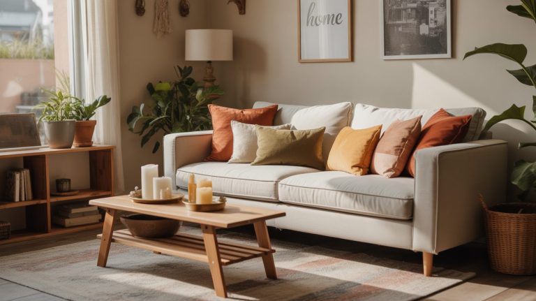
1. Living Room Vibes

- Neutral color palette base (think oatmeal walls)
- Layer trendy color palettes via throw pillows—burnt orange, emerald velvet
- Hang art that picks up those accents
Want a modern look? See modern minimalist living room ideas for inspo.
2. Bedroom Bliss

- Pastel aesthetic color palettes aid sleep—lavender + cool gray
- Add statement bedding in richer tones for depth
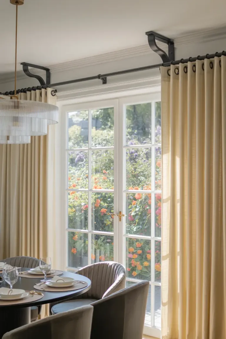
- Ceiling accent? Check out ceiling-mounted curtain rods for vertical drama.
3. Bathroom Refresh

Small bathrooms love high-contrast hues: charcoal tile with white grout plus brass fixtures. While you’re upgrading, peek at moisture-absorbing bathroom plants over on this post for functional greenery.
4. Kitchen Energy

Try an unexpected duo: matte black cabinets + warm oak shelving + spicy chili-red stools. Hungry yet?
Trending Palettes for 2025 and Beyond

| Trend | Dominant Hue | Accent | Why It Works |
| Earthy Modern | Clay | Olive | Biophilic, pairs with rattan furniture |
| Digital Lavender | Soft Purple | Chrome | Tech-friendly, calming |
| Muted Mustard | Golden Ochre | Ink Blue | Cozy vintage charm |
| Seaside Neutral | Sandy Beige | Seafoam | Light, airy, beach vibes |
These trendy color palettes echo what you’ll spot in art galleries and new builds. Speaking of galleries, get inspired by West Coast tones in California art spaces.
Tools & Tricks for Palette Perfection

Free Online Generators
- Coolors.co – Hit spacebar for instant color combinations
- Adobe Color – Import a photo to pull a neutral color palette
Swatch Hacks
- Paint stirrers + mini sample pots = cheap test boards
- Move samples around the room AM/PM to see undertone shifts
Match Décor with Ea
- Snap a throw pillow, upload to generator, get hex codes
- Shop furniture using those codes—streamlines decision-making
Need physical shopping tips? Browse home decor stores in NYC for real-world color inspo.
Common Mistakes & Quick Fixes

- Going Full Saturation Everywhere
- Fix: Limit strong hues to that 10 % accent.
- Fix: Limit strong hues to that 10 % accent.
- Ignoring Undertones
- Pink-based beige vs. yellow-based? Game changer!
- Pink-based beige vs. yellow-based? Game changer!
- Skipping a Test Patch
- Always paint a 12×12 inch square first.
- Always paint a 12×12 inch square first.
- Forgetting Lighting
- Bulbs matter! Choose 2700 K for warm coziness.
- Bulbs matter! Choose 2700 K for warm coziness.
Conclusion: Ready to Paint Your Story?

We’ve unpacked home color palettes, tested foolproof color combinations, and peeked at tomorrow’s trendy color palettes. Remember, your space should feel like a warm hug, not a paint-chip battlefield. Start small maybe just the accent wall behind your couch and see where color confidence takes you. If you’re itching for more inspo, hop over to our small bedroom ideas roundup here and let the creativity snowball.
So, what hue will you brush on first? Grab that roller, cue your favorite playlist, and paint a space that tells your story! 🎨